Branding

Effective packaging & design to meet ‘High Street Dreams’?

Posted in Branding, Design, Events, Food Packaging, Gift Packaging, Innovation, Marketing, Opinion, Retailers on July 19th, 2010 by Chris Penfold – 10 Comments
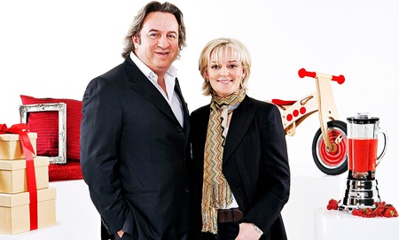
Jo Malone and Nick Leslau

Jo Malone and Nick Leslau

Friday before last saw the 4th and last programme in the mini series High Street Dreams on BBC1; The ‘reality TV show’ about product branding, packaging & design development. Over the series Jo Malone and Nick Leslau have helped a number of individuals to launch new products.

It’s been a long 6 weeks since the 3rd programme, during which the ‘void’ has been filled with all sorts of interruptions such as Wimbledon and World Cup football – how inconsiderate!

From a packaging design perspective, I don’t think that the 3rd show was as good & fulfilling as the first two, but still entertaining and was to some extent rectified in the 4th show. Whilst the advice & support given to budding entrepreneurs on High Street Dreams provides a ‘snapshot’ of what’s required in the packaging development process (usually from the ‘sexy’ brand perspective), having watched all of the programmes, I can’t help thinking that packaging has been viewed at a very superficial level. Many of the requirements necessary to get a product to market, seem to have been simply glossed-over or even ignored completely. I appreciate that many of the more technical issues that were possibly raised during development discussions were not actually shown in the final ‘cut’, but I’m sure that most of it was simply not addressed. Branding is only part of the picture. At the end of the day packaging performs a number of other varied and important roles; containing, protecting. preserving, transporting, informing & selling and has to meet a number of important stakeholder needs at all stages of the supply chain, from manufacturing & filling, through warehousing & transportation, retail and consumer-use to final disposal or reuse.

For each of the product areas covered in the programmes, a unique set of circumstances needs to be considered, depending on the product itself, the route to market (whole supply chain) and consumer needs involved. Clearly, the packaging needs for a unique Beryl Brewis woolen scarf will be different to that of a spicy Mr Singh’s Chilli Sauce or a packet of Muddy Boots premium food products.

To start with, purchasing clothes products is a much more ‘tactile shopping experience’ than for foods and whilst some up-market strategically placed packaging can enhance perceived ‘value’, the printed text is mainly aimed at reinforcing the brand credentials and providing product and bar code information for identification and tracking logistics movements and sales. With food products there is a far greater consideration graphically (text) for shelf-life (use before), food legislation, warnings and claims. But also structurally, a need to choose components that will meet the brand credentials, market segment needs and user aspirations as well as protecting and containing the product within from spoilage.

So over the next 4 days, I’ll take a look at the 4 products covered in last two shows and as well a giving an overview of what happened in the two shows and how packaging and design aspects were tackled, I’ll also take a ‘step-back’ and provide my thoughts on some of the other important issues that those entrepreneurs need to consider (or should have considered already) in the successful launch of their products to a mass market!

So keep your eyes open for the following postings on this site:

Tuesday 20th July: ‘Fashion accessories’ striving to be the next fashion brand. Beryl Brewis, a single mum from Buckinghamshire producing high quality chunky hand-knitted scarves.

Wednesday 21st July: ‘Fashion accessories’ striving to be the next fashion brand. Claire English from Lewes, East Sussex, making distinctive and eclectic homemade jewellery.

Thursday 22nd July: ‘Homeware’ – Harry Singer from Somerset with his innovative wall hanging picture ‘Monkey frames’ ( Phlib) product.

Friday 23rd July: ‘Homeware’ – Bex Simon an artistic blacksmith from East London who designs beautiful one-off metal-ware objects for the home.
Chris Penfold

Have A Can Of Love

Posted in Branding, Design on July 13th, 2010 by Jane Bear – 1 Comment

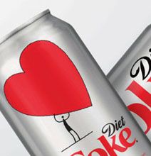
Diet Coke Love Can

Diet Coke has teamed up with the National Heart, Lung and Blood Institute to sponsor a national awareness campaign called The Heart Truth.  It’s aimed at raising the awareness of Heart Disease amongst women.  This is of course a great cause.  I’ve highlighted the pack though as I really like the design, it’s clean, simple and to the point. (Jane Bear)

To find out more about this fantastic campaign visit The Heart Truth page on the Diet Coke web site

Leveraging Captain Morgan’s brand & packaging assets through NEW media

Posted in Branding, Business News, Drinks Packaging, Marketing, Product News, Social Media, Tweets on June 18th, 2010 by Chris Penfold – 8 Comments
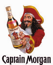
Captain Morgan wielding his packaging assets

Captain Morgan wielding his packaging assets

A few weeks ago I had the privilege to listen to Paul Walsh CEO of Diageo, the world’s leading spirits, beer and wine company, deliver a ‘marketing’ talk at Nottingham Business School (Nottingham Trent University). It was entitled “Marketing & Communication in 2010 – Responding to the New Stakeholder Condition” and was such a powerful &  interesting insight, I thought I’d provide you with an overview and share some of my thoughts with you.

Diageo is the proud owner of some of the biggest ‘power brands’ on the planet, such as Smirnoff, Johnnie Walker, Guinness, Baileys, J&B, Captain Morgan, Jose Cuervo, Bushmills & Tanqueray. Both Guinness and Johnnie Walker have been around for over 200 years and Bushmills almost 400 years. Some feat! and a tremendous bank of heritage on which to pull (or push – or whatever you like really!).

Walsh is a fine orator, who is passionate about his brands and company. He talked about the basis of all iconic brands being ‘great products’ driven by FACE (Flair, Agility, Consumer insight and then Executed flawlessly). But he also acknowledged that the global marketplace is constantly evolving which affects the way we live and interact with our favoured brands.  At the same time, broadband is proving to be the biggest technological development since the introduction of television. As the world ‘goes on-line’ a whole new media stream has opened up to feed a young and dynamic market who have ‘bags of energy’ and want to ‘party’.  Walsh highlighted this momentous change by showing the video Shift Happens – some mind-blowing & thought provoking figures (I’m sure you will agree).

So the ‘rules of engagement’ have changed, and indeed are constantly evolving. Advertising spend in traditional media such as magazines, newspapers and TV has ‘nose-dived’ and has been diverted into new media, where Diageo, and other companies for that matter, have “up-weighted their spend in the digital space” and enjoyed much bigger ‘bangs for their buck’, realising huge cost savings.

It is clear that Diageo have become masters of leveraging the new technology. Key to their success, according to Walsh, can be attributed to a 5-point plan:

1. Having a good product

2. Being clear about the target

3. Identifying the single most compelling benefit

4. Effectively dramatising that benefit

5. Saying and constantly repeating it through the most effective channels

Affiliated to this is the ability for brands to attract and become “participants in a conversation NOT simply involved in a top-down message”. Metaphorically, he likened this to a change from a game of ten-pin-bowling, with a one-ball strike to a game of pinball, banging, bouncing, to-ing and fro-ing through a maze of buffers and pins. In this new media world, Walsh alluded to 3 types of people:

Passive participants – Those who are completely passive and soak up all of the information ‘thrown at them’ via static websites

Engaged participants – people who are engaged and share information via social media platforms

Active participants – those who voraciously add content on-line and are hugely influential

These 3 groups of people seem to inhabit this digital world in approximate ratios of 90 : 9 : 1 (respectively). It is the small group of active participants have been key to Diageo’s new media brand success. By influencing these people in this sector they have turn their brands from on-shelf icons to (almost) living and breathing entities.

A classic example of this success is Captain Morgan, which has rocketed over recent years and now holds a prestigious No2 position for premium rum brands. The driver behind this has been the building and grooming of the ‘Captain’ icon as a ‘living legend’. This hasn’t happened by accident. A carefully orchestrated campaign has evolved through the ‘Captain’s Cup’, video and photo ‘collateral’ and word-of-mouth – driven by social media. The Captain has a certain physical stance or  ‘pose’ and when an interpretation of that ‘pose’ was ’struck by a famous US NFL football star on the pitch during the Super-bowl, it took on a completely new iconic dimension. There followed a series of copycat ‘poses’ by a number of esteemed brand advocates, including David Letterman on his prime-time  TV show. Media-savvy Diageo capitalised on this by offering a $10,000 prize to famous people striking the pose in public places & at high-profile events, all building on the character of ‘The Captain’ and acting s a ‘viral’ growth driver for the ‘living legend’. It has proved a very cost-effective way of marketing.

As an aside, it is interesting to note that this type of ‘non-sponsorship’ could be classed as a more passive form of  ‘ambush marketing, which is actually very topical at the moment. In the South African World Cup this week (14th June), 2 Dutch women were arrested for ambush advertising and 36 women ejected from one of the stadiums when they were spotted wearing short orange dresses made by the Dutch brewery Bavaria, in conflict with  Anheuser-Busch’s Budweiser who are the official beer of the event. It led to quite a fuss and ITV media pundit Robbie Earle was sacked from his role when it was claimed by FIFA that he had sold tickets meant for family and friends on to the Dutch beer company.

Getting back to Diageo, another fine example of leveraging the new technology, has been the Smirnoff ‘be there’ media campaign built on a ‘viral’ marketing platform. Here young (25-30 yr old) party-goers were encouraged, via social networking sites like Twitter & Facebook, to provide ideas on their perfect party events – a party that they would remember for all time – to have ‘been there’. Diageo then picked the best ideas, provided funding to hold the event and a short video was shot at each which were then posted on YouTube. Here’s an example of a Smirnoff ‘Be There‘ TV advert. These have also proved a phenomenal success for Diageo at moderate expense – a terrific Return on Investment (ROI).

So, all in all, Diageo have shown great foresight in their on-line endeavours; an area that has worked well and is sure to be developed by them further across all of their brands. If companies want to stay ‘ahead of the game’ in an increasingly fragmented market, they need to embrace and adopt new ways of working and promoting themselves (and their brands), using creativity, flair and imagination. In this respect they could learn much from Diageo.

It also goes without saying, that in these recessionary times, where marketing budgets are being slashed, left, right and centre in huge cost-cutting exercises, the time and effort invested will also reap huge benefits in cost and greater ROI…..and will also work wonders for a brands’ ’street cred’ ;-)   Why not get in touch and see how we could help you Contact Design Cognition OR, if you’re a more hands on person why not have a look at our forthcoming Branding and Shelf Impact training course.

Chris Penfold

High street packaging dreams – end in ‘the den’

Posted in Branding, Business News, Design, Drinks Packaging, Food Packaging, Healthcare & Pharma, Marketing, Opinion, Product News, Retailers on May 19th, 2010 by Chris Penfold – 598 Comments
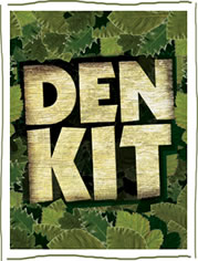
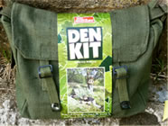
Den Kit packaging branding

Den Kit packaging branding

Monday night saw the 2nd programme in the mini series High Street Dreams (8 programmes) on BBC1. The ‘reality TV show’ about product branding, packaging & design development. Over the series Jo Malone and Nick Leslau will help a number of individuals as they try to launch new products. From a packaging and design perspective, I don’t think that this week’s show was as good & fulfilling as the first, but still entertaining. The ‘guinea pigs’ included:

Primary school teachers from Shropshire – Jo Jones & Kay Miller who developed a ‘Den Kit’ – a fun and adventure product to help kids play & learn the old fashioned way! Good old ‘home farm’ values and fun!

Initially chopping trees down themselves in rural Shropshire to make ‘handmade’ wooden mallets, they proposed a huge retail price of  £40 per pack. However after visiting the annual Toy Fair where the average toy price was £6.70, they were forced to reconsider. Their mentor David Strang, an entrepreneur & leading toy manufacturer, emphasised the importance of  ‘eye catching’ packaging (good to hear!) which helped his own products increase sales by a factor of 25!

The ladies took this ‘on board’ and a “top graphic designer” was brought in to develop the branding, but I must say it left me disappointed. Although the typography was strong, with an ‘all over’ camouflage effect. Not sure that it had enough ’shelf stand-out, without any alluring photography or a means to view the products inside. But we didn’t have the benefit of a proper evaluation of competitor packs and ’sight’ of all packs on shelf together. Certainly if it had been our project we would have also considered other packaging options (rather than standard carton) to try and incorporate the above factors and try and add more consumer appeal, convenience & value.

The ladies did manage to get their costs down substantially by sourcing components from a brother in the Philippines. Enabling a revised price point of just under £30.

They christened their overarching brand as ‘Real Adventure’ & pitched to the MD Duncan Grant of the ‘Entertainer’ retail chain who was certainly ‘wavering’ and undecided on whether or not to stock the product. He loved the ‘down to earth’ product concept and I think that most of his concern was targeted at the packaging. He mentioned that the packaging  needed “more work” but did eventually give the ‘ go-ahead’ to try out the products in his 52 high street stores in the UK.

The revised Den Kit packaging

The revised Den Kit packaging

The kit contains: tarpaulin, groundsheet, handmade mallet, tent pegs, tent peg bag, 10m rope, metal mug, camouflage paint, webbing haversack & instructions

Since filming, Jo & Kay have certainly been busy and now have other products featured on their website which you can see here: Flibberty

You can follow them on Twitter: @DenKit

The second product featured on the programme was Nutriyum. Husband and wife, Paul and Maria Stricker quit their lucrative city jobs and invested their life savings (over £15K) to create Nutriyum – a healthy drink for young kids. Developing a drink that is both nutritious and tasty is tough enough, but they had just eight weeks to formulate a product in order to secure themselves a place on the highly competitive supermarket shelves. They enlisted the expertise of Ella’s Kitchen founder Paul Lindley and Little Dish’s Hillary Graves to help them focus, but sadly time was against them and despite bags of enthusiasm,  had failed to do their homework!!

The initial products offered by Paul & Maria were banana & strawberry flavours – but containing no fruit! The product was redeveloped within a matter of days from the previous synthetic mix into a chilled fresh fruit smoothie, which the couple were expecting to sell at the premium price of £1. Leslau affirmed the importance of pitching with a real product – NOT a prototype – something that we would strongly endorse. In our experience, retailers, buyers & marketers often find it difficult to visualise the ‘final product’, so it’s critical to get as close as possible with your product & packaging in any ’sales pitch’. Something that can be achieved quite easily these days with the ability to provide quick-turnaround physical mock-ups & realistic digitally printed artwork.

Leslau also emphasised the importance of gaining ’shelf space’ with retailers. I would also mention that stores sometimes measure profits in terms of the profit per length of shelving – which needs to be borne in mind in any pack design! Retailers need to be able to:

  • Restrict their investment to the lines that will sell
  • Buy in small quantities (keeping minimum stock)
  • Buy goods that generate the highest levels of profit

Indeed we would emphasise the importance of meeting the business needs of all supply chain parties – suppliers, manufacturers, wholesalers, retailers & customers – all are interdependent.

Manufacturing was shown in more detail this week, as the young couple hired contract filling facilities to fill prototypes – at a cost of £5000 (+£1000 for materials) – only to come to the conclusion that they had been packed in an inappropriate packaging format (an expensive mistake to make and underlines the importance of thinking these things through properly and employing ‘experts’ to help from the outset – which can actually work out more cost-effective in the long run!)

The packs chosen for filling were Guala ’style’ ‘doy’ packs, commonly used on drinks like Lucozade, but would have presented the wrong ‘messages, cues & triggers’ for the ’single shot’ proposition intended. The branding agency chosen by Malone and Leslau were ‘Identica’ who (not surprisingly) struggled to find a fit with the brand name ‘Nutriyum’ and also with the overall pack proposition (considering that the product ingredients were synthetic but supposed to be healthy and appeal to young mothers). So there was a big ‘disconnect’ there. If more market research had been undertaken by the couple before developing their product/brand a totally different & more focused offering would have been achieved.

Ultimately, Paul & Maria realised their problem and simply ran out of time, so decided themselves to ‘bow out’ – a very brave decision considering the allure of retail endorsement and the TV PR coverage they would have gained for their new brand (despite that – they certainly got some good coverage anyway!). I feel that they made the right decision and will ‘live to fight another day’, once they’ve got it right.

As it happens, I undertook some research on the web today, and it does appear that the couple have been ‘beavering away’ in the background. Although the product is “not in the shops yet”, you can find out more about their endeavours on-line (link below). As a matter of interest Nutri-Yum does already appear to been trademarked by someone else (which wasn’t mentioned in the programme by anyone!)  Paul & Maria do seem to have taken ‘on-board’ the comments made in the programme and redeveloped their branding & packaging (and no-doubt the formulation also). In fact a completely different product offering! Certainly an improvement on what was shown on the TV – but probably in need of a bit more work. The brand name has been changed to ‘nyum‘. According to Wikipedia, this means “Swallowing in Catalan” – which I suppose is reasonably appropriately. However, a quick search on Google, pulls up a huge array of ‘nyum nyum’ activity & ‘noise’ – much of which seems to relate to eating BUT none of which relates to this new brand – so I feel that more work is needed there guys! You can see the latest offering on their website www.nyum.co.uk

We wish all parties featured in the programme every success with their products, but the big learnings for anyone in their position are:

  • Include product development & design specialists from the start if you want success (we can give you a free consultation if you are unsure)!
  • Make your mistakes early on in the process, before you’ve spent too much money
  • Learn from your mistakes
  • Don’t be afraid to ‘pull the plug’ if it doesn’t feel right!

Next week the High Street Dreams team will help two sets of partners market fashion products. If you want to watch last night’s programme again you can download it on i-player here: 17th May programme

Cheers

Chris Penfold

High street dreams? a packaging reality!

Posted in Branding, Business News, Design, Food Packaging, Marketing, Product News, Retailers, Social Media on May 11th, 2010 by Chris Penfold – 4 Comments
Mr Singh's new branding logo

Mr Singh's new branding logo

A  new mini series High Street Dreams (8 programmes) kicked off on BBC1 last night that is a ‘reality TV show’ about product branding, packaging & design development – and very entertaining it was too. Over the series Jo Malone and Nick Leslau will help a number of individuals as they try to launch new products. Last night’s ‘guinea pigs’ included:

Mr Singh’s Chilli sauce (www.mrsinghssauce.co.uk) and Asian Singh family of 7 from East London who have developed a unique “dynamite” chilli sauce over a number of years and now want to “take on the world”. Having already developed their own packaging they were ‘knocking out’ 1000 bottles a day in their garden shed. However, after undertaken some market research on local doorsteps they redefined their key brand messages and with the help Pearlfisher, undertook a complete brand overhaul. Anyhow, it must have been successful because the conclusion was a trial in 3 London Asda stores and their website now lists a number of other independent stockists.

New Muddy Boots brand logo

New Muddy Boots brand logo

Meanwhile, Roland & Miranda Ballard, the couple behind the gourmet ‘Aberdeen Angus’ burger range Muddy Boots Foods, worked with Blue Marlin. Together they revamped their vacuum packed burger range, which when showed to shoppers in it’s existing packaging, was described as “looking like dog food”. Anyhow, after development of  bespoke ‘windowed’ carton to show-off a tantalising view of the top-quality prime cuts, they managed to secure a trial in a few Waitrose stores (although Waitrose weren’t totally convinced of the merits of the small window). So top marks to all concerned! A good insight for those of you not involved in teh industry, on how a brand and packaging can be redeveloped & invigorated. You can find out more about Muddy Boots foods at (www.muddybootsfoods.co.uk). Both companies also have Twitter accounts (@mrsinghssauce & @muddybootsfoods ) and they both have Facebook accounts.

Next week the High Street Dreams team will help two sets of partners market children’s products. If you want to watch last night’s programme again you can download it on i-player here: 10th May programme

Cheers Chris Penfold

Mothercare alluring packaging for baby toiletries

Posted in Branding, Design, Healthcare & Pharma, Marketing, Product News, Retailers on April 26th, 2010 by Chris Penfold – Be the first to comment
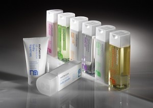
New Mothercare Packaging - All We Know Range

New Mothercare Packaging - All We Know Range

Earlier this year Mothercare launched a new range of branded baby toiletries products called ‘All We Know’, the packaging and branding for which was undertaken by John Rushworth and Daniel Weil. I think that this is a  great peice of packaging design by John & Daniel and agree that the “creation of a coherent and focused sub-brand enables Mothercare to draw on its reputation as a trusted brand whilst adding new elements that help to differentiate these products from the competition”. Look out for it on the shelves and let us know what you think. In the meantime, you can read more about it’s distinctive aesthetic, ergonomic and practical packaging and branding features here: Mothercare All We Know range @ TheDieline

Cheers Chris Penfold

Definite Thinking Out Side Of The Box

Posted in Branding, Design, Marketing on April 14th, 2010 by Jane Bear – 5 Comments

Ok, ok, I know it’s a bad pun, but I like the thinking behind the new puma packaging.  It’s a bit of a shame it didn’t go further though.  The bag it’s self looks great, and if they had the right kind of shipper packaging what else would they need?  Why do they still need so much corrugated board?  Maybe that is more down to their consumer image and how they think the bags on their own might be viewed.

 There is obviously some thought gone into their plans though and I have to say, the idea that they can save on packaging just by folding their t-shirts one extra time is great.  Credit where credit is due. Jane Bear

If you would like to see their promotion video just visit  You tube or if you would prefer to read an article why not try this one in Packaging News

DAY 8 – Packaging Tip No8 – Information & communication

Posted in Branding, Design, Legal, Opinion, Safety, Top 10 Tips, Uncategorized on March 15th, 2010 by Chris Penfold – 8 Comments
Packaging Top Ten Tips

Packaging Top Ten Tips

In order to help you develop your packaging more productively, we have generated a series of  FREE short 1-2 minute videos detailing our Tip Ten Tips for getting it right. We will be posting 1 x video per day on this blog site over a 10 day period – so keep a look out for them – they could save you a £££$$$ fortune in the long run!

DAY 8 – Tip No8: I don’t need to tell you how important branding is on a pack, do I?. Get it wrong and you’ve got a ‘dead duck’ on your hands! But wording on packs performs many functions. There are many legal requirements & you must be able to substantiate any claim you make. Aesthetically the wording & graphics must work in harmony. Incorrect wording is the most common reason for product recalls, which can cost a producer many £000’s. Find out more on the video….

Have fun packaging. Cheers Chris

Today’s Video:

Packaging Tip No8 – Information & communication – by Chris Penfold – Design Cognition

Look out tomorrow for Tip No 9 – Cost minimisation…..

DAY 3 – Packaging Tip No3 – Market Positioning & Branding

Posted in Branding, Design, Marketing, Opinion, Top 10 Tips, Uncategorized on March 8th, 2010 by Chris Penfold – 4 Comments
Packaging Top Ten Tips

Packaging Top Ten Tips

In order to help you develop your packaging more productively, we have generated a series of  FREE short 1-2 minute videos detailing our Tip Ten Tips for getting it right. We will be posting 1 x video per day on this blog site over a 10 day period – so keep a look out for them – they could save you a £££$$$ fortune in the long run!

DAY 3 – Tip No3: Who are your target market? What are their expectations in terms of product & packaging? Watch the video to pick up some questions that you might want to ask yourself & things that you might want to consider…

Enjoy your packaging.

Cheers Chris

Today’s Video: Packaging Tip No3 – Market Positioning & Branding – by Chris Penfold – Design Cognition

Look out tomorrow for Tip No 4 – Market supply chains…..

Elo – packaging designer under the ”Creative Spotlight’

Posted in Branding, Cosmetics & Toiletries, Creative Spotlight, Design, Design Cognition News, Design Library, Drinks Packaging, Food Packaging, Gift Packaging, Marketing, Opinion, Uncategorized on February 25th, 2010 by Chris Penfold – 10 Comments

At Design Cognition, we are passionate about packaging, design & creativity. We like to work with some of the worlds’ leading edge packaging designers, but also identify and nurture some of the brightest up-and-coming talent coming into the industry. We’re on a mission to unearth the very best designers and creators to see what makes them ‘tick, what ‘fires them up’ to get out of bed in the morning and who/what inspires them. We’re starting a a new initiative called the ‘Creative Spotlight’. In the first of the series we’ve interviewed a fantastic designer from California called ‘Elo’ (MarcELO), who has a very distinctive style all his own. Enjoy! and watch out for other great designer interviews coming soon! Chris Penfold

1. Elo, could you tell us where you’re from and how you got started in the field?

I originally come from South America, Rio de Janeiro, Brazil. I’ve also lived in Europe and Canada. Today I live in sunny San Diego, California. I came here for school, I graduated and I run my own freelance design company, ElO Designs. I was always involved with art ever since I was a kid. My sisters and I did some plays together and then I thought I was going to be a singer. I took singing classes for 1 year and I formed a band. We were great but too many. Then things started to fall apart and the band was over after a year. Since I like traveling, I wanted to create a website to show my friends and family the places I was visiting at the time. So, I bought my first HTML book and started to learn all by myself how to create websites using only the codes and the notepad. I thought it was a lot of fun and after that I never stopped. My older sister was a graphic designer at the time, she didn’t have a computer and was doing all the arts by hand. Using amber leaf and ruby leaf, gluing stuff together, using the T ruler and ink
pens that needed to be soaked in water over night. “What a mess it was”, (laughs) but I learned a lot from her as well!.
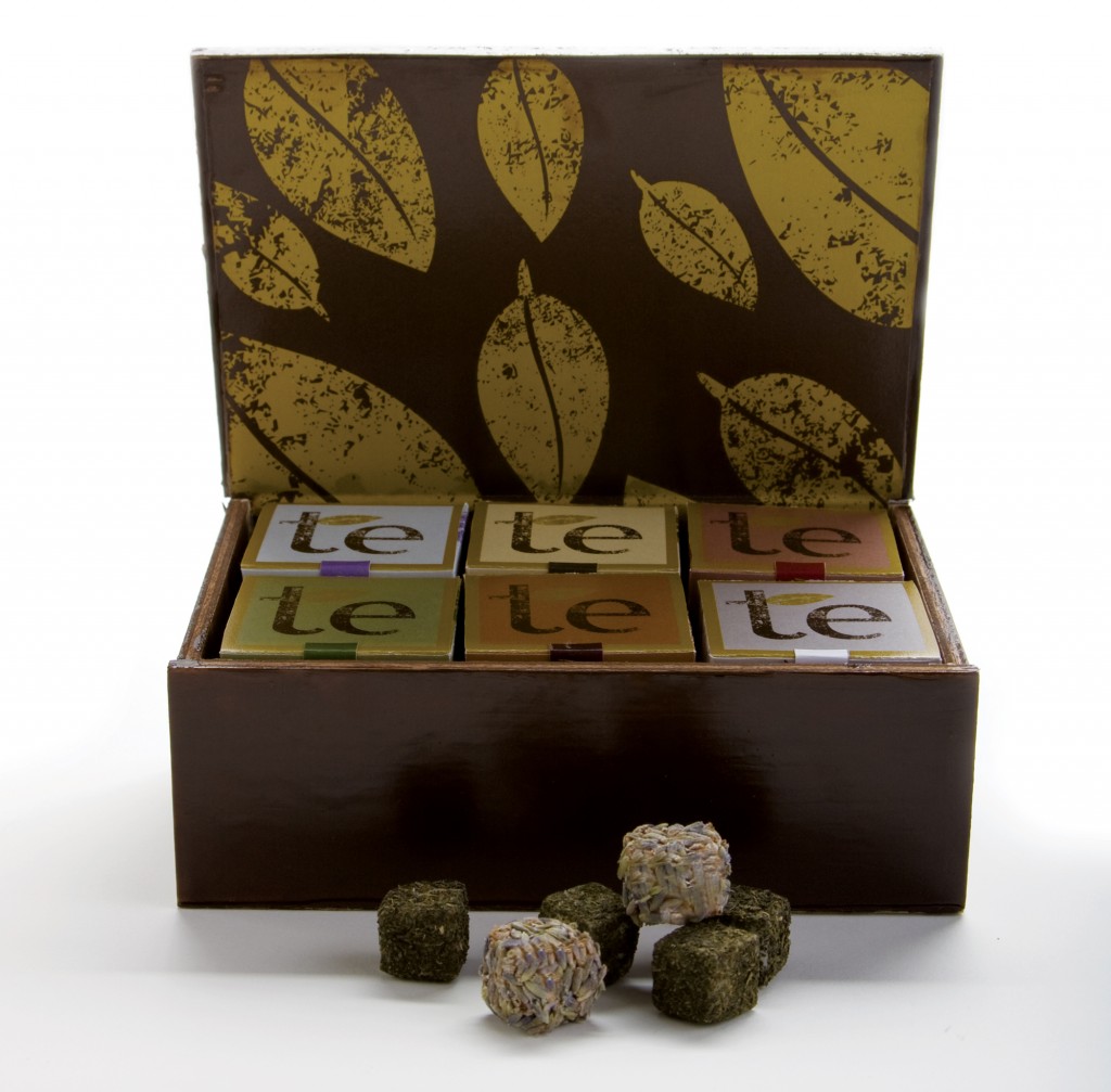
Elo's lovely 'te' packaging for an upmarket tea range

Elo's lovely 'te' packaging for an upmarket tea range

2. Elo, what gives you inspiration when starting a design project? How do you blend all of your ideas in a harmonious way?

Well, my inspiration comes from various places: TV shows, patters, nature, magazines, or just from playing my games sometimes. There are days that my mind is a complete blank. And there are some other days that I get up in the middle of the night with a great idea. Then I either have to write it down or go to the computer and start working on it right away… Now, if I’m working with clients I have a questionare that I send to them to try to understand what they want me to do. Most of the time things go smoothly but sometimes clients have no idea what they want and it gets a little bit hard. In that case, I would say that, when working with indecisive clients it’s always good not to send them too many ideas. Limit yourself to 3 concepts. I like working with colors but I don’t like it when the colors overpower the final composition. So, I try to be really careful on that. It’s also good to know and understand color theory, color wheel, primary, secondary and tertiary colors. That helps to find the balance in the final composition.
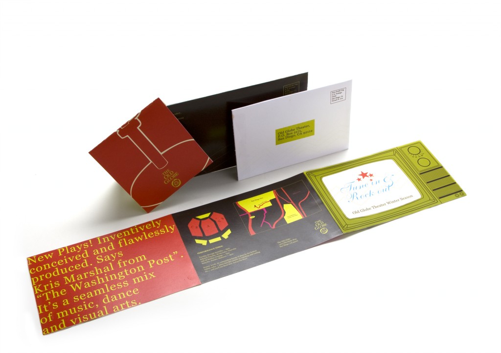
Elo's 'old globe' brochure work

Elo's 'old globe' brochure work

3. Did you study graphic design formally in school/college (did that include packaging & typography?) or are you a self-taught artist? And in your opinion what are the pro’s and con’s of each route?
I went to a great Design School here in California and I got an AA( associate degree) in Graphic Arts with great professors. I’m specialized in packaging and print design. I think that when you have some talent school always counts and you can learn great techniques from other professionals. I have seen great design work from people with no schooling and I have seen portfolios from people with Bachelor Degrees that make me think ‘Ummm…really???’. So, I guess it all depends. School helps, It will also help to get technical if you’re not so talented. But school won’t make you. You are the only one who will find your own identity as a designer or artist.
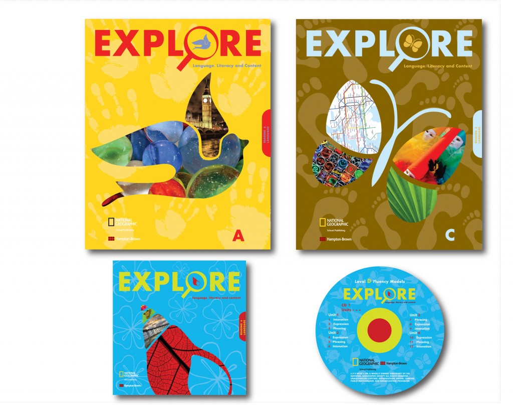
Elo's artistic 'Explore' range of book covers

Elo's artistic 'Explore' range of book covers

4. How do you define yourself as a designer and what strong point do you think that every packaging designer should have?

I define myself as an artist who has a design career for now. I think every packaging designer has to think ‘outside of the box’. It’s important to think about sustainability and about the practical part of the design you are creating. The most important thing is to think about the target audience you are designing/creating for, because they are the ones who are going to consume your product.
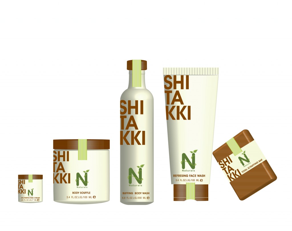
Elo's 'naturals' men's packagng range

Elo's 'naturals' packagng range

5. How do you feel that packaging design work differs from other areas in which you work? Why do you think that is?

Well, I like packaging and branding the most amongst all other things that I do.. I also love what I have been doing at the moment, called: “Photo Illustration”. It lets me be very creative and show the ‘true me’ as a designer. But I think all areas have their own importance. Today as a designer you must know a little bit about everything. We are all visual human beings and we are surrounded by designs everywhere. From the time get up to the time we go to bed. If the color differs, if the shape differs, if the usage of the product differs, if you respect the visual hierarchy, the product will cause an instant reaction to the consumers and will stand out from the shelves. That’s when you know the design really works, when it stands out amongst others.

'Birds' - an example of Elo's amazing 'Photo Illustration' work

'Birds' - an example of Elo's amazing 'Photo Illustration' work

6. What’s your favourite piece of packaging design work that you’ve undertaken yourself and why?

I’m happy with all my designs. I never put anything out there if I’m not 100% happy with it. But one of my favorite pieces is my “Eko” Home Cleaning Supplies Design. I put a  lot of thought into it. I was really happy with the overall result and I think I accomplished it beautifully, from the color pallet to the cohesion of the illustrations. The design was recently asked to be featured in a Japanese magazine about packaging and design. I guess I can call it successful right?! (laughs).
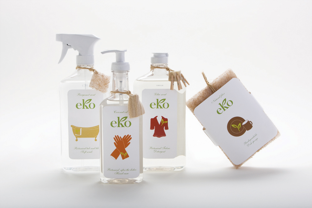
Elo's distinctive EKO packaging design

Elo's distinctive EKO packaging design

7. What’s your favourite all-time piece of packaging design that’s out on the market (i.e. designed by someone else) and why?

Oh Man…. that is a tough question for me ’cause I like so many designs. Target these days has great packaging designs. I like “Method” home products, I like “Scotch Brite” eco-friendly sponges, I like Paul Michel shampoo packaging, Aveda has great packaging and great ads as well, I like Michael Graves(industrial design) and Apple designs.
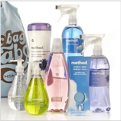
Distinctive packaging of the 'Method' range of homecare products

Distinctive packaging of the 'Method' range of homecare products

8. Thinking specifically about packaging design, who would you say provides you with “design inspiration,” meaning designers that you look up to; and also tell us why you feel this way about  them, what makes them special?

I try not to look much on already done stuff. So, this way when I design something I get my own signature to the product I’m working on. But there are tons of designers that I appreciate, I Like: Michael Graves(Industrial designs) visit his website at (http://www.michaelgraves.com/mgdg.htm) The guy is a genius. Everything he does has this round polished shape to it and when you look at his products you say: “That is Michael Graves”!
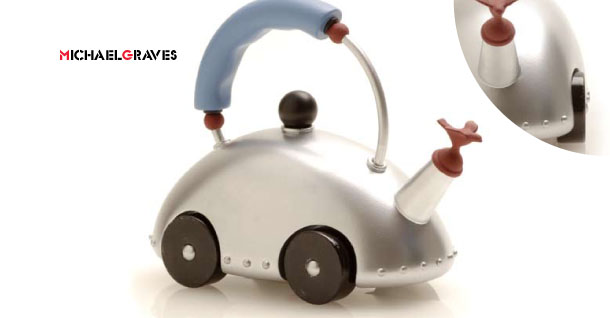
One of Michael Graves' zany kettle designs

One of Michael Graves' zany kettle designs

9.  Any final thoughts for our readers?

When you do something in life, do it with your heart. Always try to push yourself over the limit to get better and better. Read, undertake research, visit blogs, create your own blog, connect to some other groups. There are so many fantastic designers around the world. Never limit yourself. You won’t have fireworks all the time. And you might also find people with huge egos, who will try to cut you off or turn you down as in any other artistic industry. But if you stay true to yourself you will get there!

10. Elo, where can we find you on-line?

My personal website is always an endless work in process. Right now I’m still working on it but you can find me on-line in various places. Here are some:
http://www.coroflot.com/elodesigns
http://elodesigns.deviantart.com
http://www.behance.net/elodesigner
http://thinksmartdesigns.blogspot.com/
http://twitter.com/elodesigner

That’s great. Thanks Elo and all the best for the future – you’re doing some wonderful work there – keep it up.

Cheers

Chris