Branding

3D packaging graphics via fresnel lenses help repair & protect

Posted in Branding, Design, Healthcare & Pharma, Innovation, Marketing, Technology on April 11th, 2011 by Chris Penfold – 19 Comments
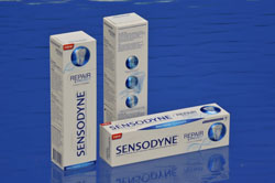
New Sensodyne carton packaging using Fresnel lens technology

New Sensodyne carton packaging using Fresnel lens technology

Local Nottingham printer, Chesapeake Pharmaceutical and Healthcare Packaging has helped develop packaging for GSK’s global launch of its new Sensodyne Repair & Protect oral care product. The novel cartons feature 3-D features intended to simulate a life-like model of a tooth as well as close-up images that help to describe the benefits of using the product. The effect is achieved by the incorporation of a series of ‘Fresnel lenses’ into the carton-board, which demands absolute production precision. The lens area is then overprinted, which requires exacting print registration. The resulting life-like perspective produces the impression of depth which provides the pack with a tactile quality that is further enhanced by the carton’s bevelled edge.

An interesting product feature that certainly has a novelty appeal but I’m not sure how effective the 3D-effect will be in educating and informing consumers. An improvement to this could be via use of 2D data matrix barcode to take consumers to a GSK website that then provides more in-depth information and videos. What do you think?

Source: PMPNews.com
Read more about leading-edge technologies that could add value for consumers by following this link to our Technology Folder

Chris Penfold

Packaging serialisation of pharmaceuticals gains pace in Brazil

Posted in Branding, Design, Government, Healthcare & Pharma, Legal, Opinion, Technology on November 22nd, 2010 by Chris Penfold – 15 Comments
Brazil’s law requiring serialisation for pharmaceuticals gains pace

Brazil’s law requiring serialisation for pharmaceuticals gains pace

At Design Cognition we believe that the following legislation will have a major impact on any pharmaceutical company manufacturing and/or selling medicinal products in Brazil. In a major drive to eliminate counterfeited medicinal products; unique labels are to be supplied by the Brazilian Government’s ‘National Mint’ for medicines registered with the Brazilian Authorities.

All medicines will be required to have labels applied to their packaging before January 15th 2012. It will be illegal to sell products without these labels in place. Pharmacies throughout Brazil will have label readers installed to verify the labels on the products in time for this deadline.

This initiative is far more controlled and constraining than other anti-counterfeit measures put in place by Governments in other country, for example in France, where 2D data matrix codes are to be incorporated on all medicines by the end of this year.

The  introduction of this legislation, although delayed from June, has taken a ‘new turn’ recently, as emphasised in September by Peter Schmitt of Montesino Associates, who provided an update on the impending law in the live Webcast, “Update: Brazil Law 11.903—An “Emerging” Regulation for Traceability & Serialization.”

ANVISA is the Brazilian National Health Surveillance Agency and was established in 1999. The law and the original ANVISA guidelines detailed a program of serialized code in 2-D Data Matrix format on a security label printed by the national mint that was to be rolled out in June 2010. Subsequent ANVISA announcements delayed the timeline, but in November, ANVISA indicated that it will require all pharmaceuticals sold in Brazil to comply with its program by January 2012.

On November 3, ANVISA posted a Normative Instruction to the Daily Journal (Brazil’s equivalent to the United States’s Federal Register) detailing its decision to move forward with the self-adhesive security labels supplied by the Brazilian Mint (known by its Portuguese initials: CMB-Casa da Moeda). According to Schmitt’s translation, ANVISA states in the Instruction that “the self-adhesive labels shall contain an individual, unique, and non-repetitive identifier, called the IUM (Brazilian Initials for Unique Drug Identifier), printed in legible characters, and consisting of a two dimensional bar code. . . . The other specifications of self-adhesive labels are the responsibility of the Mint of Brazil and will be published by that entity.”

The self-adhesive labels, often called “Safety Labels” or “Stamps” by ANVISA, “will be supplied by the CMB to each company with drug registration in Brazil, regularized with ANVISA.”

The labels will feature an “invisible marker” for authentication that can only be recognized by the special readers. Measuring 19 × 25 mm, the labels will feature “micro fibers and coloured beads visible only under ultraviolet light” along with “micro cuttings to protect against attempted tampering,” Schmitt reports.

Over the next seven months, ANVISA will be supplying readers to pharmacies at no cost to them, which will enable them to authenticate the labels.

“Data from the security labels will be connected via the IUM and Brazil’s Electronic Invoice system and will be the responsibility of the Treasury Secretary of Brazil,” Schmitt explains.

“Pharmaceutical companies have 60 days to enroll in the program (not to implement) by signing a contract with the CMB,” Schmitt adds. “Shipment of the labels to the pharmaceutical company must begin within 60 days after the contract has been signed.”

Companies will have six months to start using the label for products produced in Brazil and 12 months for products imported into Brazil, Schmitt reports. After January 15, 2012, all pharmaceutical products sold in Brazil are required to have the safety label on their packaging.

Watch this space for further updates. You can read other pharmaceutical & healthcare-based packaging articles by following this link to Design Cognition Pharmaceutical Posts

Or follow this one to read the full Brazilian serialisation PMPNews article

Chris  Penfold

Branded Packaging That Delivers – Transform Your Products

Posted in Branding, Design, Design Cognition News, Events, Innovation, Marketing, Product News, Retailers, Training, cost-optimisation on November 3rd, 2010 by Chris Penfold – Be the first to comment
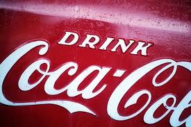
coca cola - branded packaging that delivers

coca cola - branded packaging that delivers

In today’s increasingly competitive marketplace, effective branding is essential.

So we are running a 1 day course to give you hints, tips and pointers on how to make your product stand out on shelf through effective packaging as a marketing tool.

It will explain how to transform your good brand into a GREAT brand and help take your products to the ‘next level’, looking at a number of important aspects including brand values, added value & convenience, rationalisation, pack size, reducing material cost and innovation to get retailer acceptance, drive sales and increase profitability.

9th December 2010 at Biocity in Nottingham, UK

HURRY NOW – find out more & how to register to get an EARLY BIRD DISCOUNT by clicking Branded Packaging That Delivers

Catalent Pharma to use Digimarc Media Enhanced Packagingâ„¢ Solutions globally

Posted in Branding, Design, Healthcare & Pharma, Innovation, Product News, Technology on September 28th, 2010 by Chris Penfold – Be the first to comment
Media Enhanced Packaging Solutions - 'raise the game'

Media Enhanced Packaging Solutions - 'raise the game'

The US-based Digimarc Corporation has recently been working very closely with New Jersey-based Catalent Pharma Solutions, a leading provider of innovative packaging solutions to the pharmaceutical, biotechnology, and consumer healthcare industries to take interactive pharmaceutical packaging to the ‘next level’. It has licensed its mobile visual search software that, together with it’s leading-edge Chroma watermark printing technology, will allow Catalent to deliver new Media Enhanced Packaging solutions to its clients worldwide that will instantly connect consumers to a range of network services from printed packaging, inserts, and labels using smart phones and other digital devices.

Digimarc’s mobile software enables the phone’s camera to “see” digital data that has been embedded into all forms of printed materials, including advertisements, editorial content, brochures, posters, product packaging, labels and more. Unlike 2D barcodes or QR codes, the digital codes do not take up precious space on packages, and they are imperceptible to human senses, but can easily be detected by computers, networks, and today’s most popular smart phones. So they not only open up all sorts of possibilities for more advanced covert counterfeiting measures to be taken, but also for additional patient and Healthcare Practitioner (HCP) information, advice and interaction.

You can read a more information at www.digimarc.com and www.catalent.com

We are really passionate about helping our clients identify and implement new and exciting technologies so why not give us a call now and see how we can help you – +44(0)115 8461914

You can find other related Design Cognition articles on ‘Intelligent’ packaging & technology here:

Design Cognition Technology Insights & News

Chris Penfold

Branding/shelf impact course

Posted in Branding, Marketing, Training on September 7th, 2010 by Jane Bear – Be the first to comment

Design Cognition are pleased to announce that we have added a new course to our already popular training program.

Branding StarIn today’s increasingly competitive marketplace, effective branding is essential. Our branding/shelf impact course will give hints, tips and pointers on how to make your product stand out on shelf through effective packaging. It will explain how to transform your good brand into a GREAT brand and help take your products to the ‘next level’.

For more information on this or other training courses we are running please visit Design Cognition Training

Developing a product & packaging? There’s no such thing as a ‘free launch’!

Posted in Branding, Design, Marketing, Opinion, Social Media, Top 10 Tips, Training, cost-optimisation on August 10th, 2010 by Chris Penfold – 6 Comments
There's no such thing as a free launch

There's no such thing as a free launch

The trouble with television programmes like High Street Dreams and Dragons Den, is that they only provide a
‘snapshot/soundbite’ of branding and the product development process, making it all appear oh-so-easy to the average ‘personon the street’. In reality, it’s a complicated process and there are a number of steps involved that should be considered before even thinking about approaching a branding or design agency and spending ‘hard-earned’ cash.
At Design Cognition we routinely get approached by all manner of entrepreneurs and small business owners who have very limited experience of branding and New Product Development (NPD). So we thought that we ought to provide some ‘pointers’ for those of you new to this arena, to get you to ‘stop and think’ and focus on what it is you are actually trying to achieve! It’s not in your interests or ours to develop products that have a high probability of failure.

So here are some fundamental questions to ask yourself, before you even think about branding & packaging:

read more »

Art, branding, packaging & a pestle – forged with love

Posted in Branding, Design, Events, Exhibitions, Gift Packaging, Marketing, Opinion, Uncategorized on July 23rd, 2010 by Chris Penfold – 12 Comments
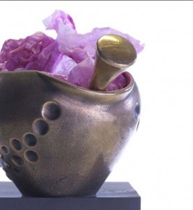
Bex pestle & mortar

Bex's beautiful pestle & mortar

It’s Friday and we’ve reached the end of a journey – the last in our series of reviews of the High Street Dreams, BBC ‘reality TV show’ about product branding, packaging & design development. Following on from yesterday, we continue to look at ‘Homeware’, but this time it’s the turn of Bex Simon, an artistic blacksmith who designs beautiful one-off metal-ware objects for the home.

From her forge in East London, she produces stunning one-off commissioned ‘works of art’ in steel. Everything from table-top candelabras to ornate garden gates. Like many other small businesses, she is limited by the achievable output from her ‘one-woman-band’ operation and to meet demand in a more ‘cut-throat’ commercial world would need to find reliable partners/outsourced resource who could produce her designs to the same quality but at a fraction of the cost.

Bex’s mentor in the show was product designer Nick Munro, who is famous for (at the age of 23) kick-staring his ‘business empire’ by turning a bedspring into a commercial success as an ‘egg cup’. He has since created ranges for John Lewis, Arga and Fired Earth, with over 500 designs in production. As a starting point he took Bex to the Victoria & Albert museum (V&A) to study 5 centuries-worth of ironmongery as inspiration. Was she inspired? You bet! Everything from cotton-twist glass, pan hangers, bells, door chimes and (the crowning glory) a pestle & mortar, which got Bex really excited!

So off she went to design her own and a week later, after mapping out all of her ideas on a giant floor-mural, came ‘back to the table’ with a wonderful pestle & mortar of her own. She contacted a commercial casting foundry regarding a mould and after commissioning a prototype, she sat down with the Jo Malone, Nick Leslau and Nick Munro to be quizzed about costings and, like many of the other creative ‘contestants’, failed miserably when it came to business and finance. Bex’s solution was to involve her husband Dave more in the business to cover the financial aspects, leaving her to cover the artistic elements.

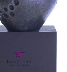
Bex's alluring carton branding with pink logo & embossed bubbles

Bex's alluring carton branding with pink logo & embossed bubbles

At this point branding consultancy Landor were brought into ‘the frame’, providers of branding to well known brands like Heinz Baked Beans, Morrison’s supermarkets and Vodafone, to name but a few. The result was some very alluring branding in the form of an eye-catching and distinctive bright pink anvil logo (great) and a very appropriate grey/slate carton embossed with some swirling bubbles, the logo and a short sentence on the back of the carton, also in bright pink lettering (tastefully done): “FORGED with LOVE”. Bex says of the logo, it was a “cleverly designed pink colour infill to be off centre to represent the jarring from the strike of the hammer” The box was lined with some matching bright pink tissue paper which added vibrancy & energy to the pestle and mortar product within. See the picture above. Of all of the High Street Dreams packaging shown over the past few weeks, this is my favourite. Bex says herself, on her website: ”the colours we chose for the packaging and website were to represent the filth and grime of the workshop, whilst maintaining a luxurious and premium feel.” Having looked at Bex’s website (link at end of this post), I think that the branding there is also well put together and professional looking – overall it’s all very well coordinated.

Along with Harry Singer (see yesterday’s Phlib post), the ‘big test’ for Bex was a 1-day test that Jo Malone sorted out at the national lifestyle exhibition – The Ideal Home Show at Earl’s Court in London. The three things that they were trying to evaluate were:
1.    How you sell your product
2.    Whether you are great PR ambassadors to your product
3.    How the consumers view your product

Unfortunately for Bex, unlike Harry, consumers weren’t as engaged for her, with products priced at £125 for a pewter? (or maybe steel) pestle and mortar and £250 for a bronze version. Everyone liked her work but no one was willing to pay that sort of money for a piece of ‘kitchen decorative art/furniture’, even though it was all “hand finished and polished”. This led to a concern by Jo and Nick that Bex wasn’t ready to pitch to a retailer – they thought that she needed more time to get her ‘act together’, which Bex took pretty well really. So she lived to ‘fight another day’. It’s interesting to note that, since the programme Bex announced on Twitter recently that she had been approached by Heals with a view to displaying some of her work in-store. So that’s a positive conclusion – well done Bex!

In terms of packaging, where does that leave us?

As far as I can tell, at the moment the only products that Bex is selling as ‘retail items’ are the pestle & mortar, which are available on her website for a price of £80 now  – a big reduction on what they were being sold for at the Ideal Home Show exhibition. Other products, such as her wrought iron gates and garden furniture etc are generally huge and bulky, one-off items. These are impractical to develop or even have a need for a range of bespoke packaging but I think that Bex should make the most of her branding and maybe make some wrought-iron ‘tags’ on which she could etch “FORGED with Love from Bex” with her logo (each painted pink) as a really engaging and personal note to each customer – and that would be really novel!
Informing
I believe that there is also a place for Bex to print some really high quality brochures (if she hasn’t done so already), with some stunning atmospheric photography to engage consumers at an emotional level, providing an opportunity for Bex to ‘connect’ with her target market. She could provide all sorts of information on the brand heritage, her vision for the business, brand values, the methods she uses to make her artistic creations, the quality of materials & methods used and really build an emotional story on which to ‘pivot’ her brand.
Transporting & Protecting

Clearly there is a need to transport and protect the large items as they are transported, which is probably best performed by some form of ‘designer (pink?) bubble-wrap’ or other, more environmentally friendly material. Careful use of traditional ‘padding’ materials like corrugated board and bubble-wrap can provide a simple enough ‘filler’ to protect the product from crushing, but there are a number of alternative organic, compostable and ‘sealed air’ filler materials around now that can also provide a more ‘environmentally friendly’ transit packaging solution. These could be complimented with the embossed ‘anvil’ metal labels that I mentioned above to provide some branding.
I hope that this has highlighted SOME of the added branding and packaging considerations that need to be taken into account when developing and selling high quality bespoke art products to the market. Well done Bex, we wish you every success in the future.
You can find out more about Bex’s products from her Bexsimon website.
Chris Penfold

Packaging? You’ve been framed!

Posted in Branding, Design, Environmental Issues, Events, Exhibitions, Gift Packaging, Innovation, Marketing, Opinion, Product News, Uncategorized on July 22nd, 2010 by Chris Penfold – 10 Comments
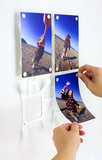
Phlib (Monkey) Frames

Phlib (Monkey) Frames

So it’s Thursday and it’s time for us to continue our review of High Street Dreams, the BBC ‘reality TV show’ about product branding, packaging & design development and in particular look at ‘Homeware’ and Harry Singer from Somerset with his innovative wall hanging picture ‘Monkey frames’ product.

Harry is a likeable 34 yr old whose idea consists of a fantastic way to display photos using magnets and a metal frame. It was conjured up “in the pub” two yeas ago after ‘connecting’ the thoughts that it’s easy to print photos on-line these days but difficult to display them on the wall. So he made a few ‘Monkey Frames’, as he called them ( a “cheeky, hanging product”), and sold them to friends. The rest ‘is history’ as they say. Before the TV show he’d already spent £4000 developing the idea further, so he was pretty serious about it – a great product that’s really unique. Harry, quoting the likes of Google and IBM, with their straplines “organise the Worlds information” and “a computer on every desk in the home” came up with his own version “get photos on every wall in every home”.

However, after a day spent at Goldsmith’s University on ‘market research’ some interesting issues were highlighted:
1. The name ‘Monkey Frames’ didn’t particularly appeal to students.
2. The modularity (or lack of it) of the system also seemed to be an issue.
So Harry had a lot to think about. Critic Nick Leslau reiterated these concerns about the product concept (being a fixed system for 16 photos) and thought that Harry should rethink it and try to redesign it into a more flexible system. Enter designer Ben DeLeesy, famous for his ‘red carpet’ dresses, who then branched-out into interiors 10 years ago. His philosophy: “The product has to stand the test of time – you can’t just be a fleeting trend”. He now has one of the biggest ranges of ‘homeware’ on the High Street. His thoughts on how to make ‘Monkey Frames’ appeal more to the consumer were: “ingenuity, ambition, hunger & drive. If Harry gets the timing & product right, the £’s & pence will follow big time.” Easy peasy then!

The first job Ben suggested was to undertake a competitor review, looking at products like a ‘shower curtain’ (a hanging photo product). He was quick to point out to Harry, that “It’s not about your love of photos. At the end of the day, this is business!” (Wise words for any new start up entrepreneur). On the flip side, commenting on Harry’s design, he said: “I love them, but you need to break it down into different sizes, not just a ‘one- hit-wonder’. You’ve got to make it more versatile, to reach a broader base. At that point I think it dawned on Harry the amount of work that he still had to do – and in a very short space of time!

To cut a long story short, Harry went away, completely redesigned his product and in the process made it look really ‘tacky’& cheap (to get the cost down) and was pushed (by the HSD evaluating team) into deciding whether to stick with a ‘cheap-jack’ version or as Ben & the team intimated, take it back ‘upmarket’ and redevelop a ‘cheap-jack’ version later. To everyone’s relief he chose the latter – and everybody was happy.

Enter branding agency ‘Heavenly’, who rightly (in my view) affirmed that ‘Monkey Frames’ (as a  brand name doesn’t work too well). It describes the product and not the ‘lifestyle choice’ that the product could deliver. It was also polarizing (aimed at a young consumer) and not of broad appeal.
Their solution:
Brand ‘Phlib’ was unveiled – Photo Liberation – “Set your photos free” – great concept and easy to remember. I like it!

The ‘big test’ was a 1-day test that Jo Malone sorted out at the national lifestyle exhibition – The Ideal Home Show at Earl’s Court in London. The three things that they were trying to evaluate were:
1.    How you sell your product
2.    Whether you are great PR ambassadors to your product
3.    How the consumers view your product
Harry got a great response at the show, making his first sale, but when the ‘financials’ were discussed, it came to light that Harry needed to sell 10,000 units to recoup his tooling costs and 20,000 units to ‘breakeven’ – a big investment on his part and a bit of  ‘millstone round his neck’!

Anyhow, that aside, Jo and Nick put Harry through to pitch to Heals, one of the most influential homeware retailers in the UK. A 200 year old store with a turnover of £37M  and renowned for ‘breaking’ new designers. He got to pitch to Trading Director Gillian and Head of Accessories Furzana. Apparently they get to sit through 1000 pitches per year and of those, roughly 50% are successful.

Suffice it say, they liked Phlib and gave Harry an initial order of 100. Although Harry was clearly disappointed, it presented a great PR opportunity for him to ‘sell his story’ & background to ‘real customers’ and gain an awful lot of knowledge in the process. As Jo pointed out; “This is like the golden ticket’ – you have to take this opportunity and make it your own”

So what a bout the packaging? (hooray I hear you say!). ……The Heals buyers did mention the packaging at a superficial level. They liked the phrase on the promotional poster “photos belong on your wall – not on your hard drive (well done Heavenly again), but as I’ve mentioned on my other posts about this series, the packaging wasn’t entered into in any great depth. Not surprising bearing in mind the time constraints of the show. So let’s have a look at that now and think about some of the packaging issues that Harry will have either now, or potentially in the future, and try to help him pre-empt them.

As well as selling through Heals (assuming that Harry still is), he is also selling ‘on-line’ from his own website. So what sort of things should Harry consider? Let’s have a look at some of them:
Selling

Harry’s website does a great job at ‘selling’ the brand. On-line retail means the packaging does not really need to perform a selling role at Point of Sale (POS). I’m not sure if Harry is still selling at Heals and how these products are packaged to provide a consistent brand image with website and POS, but it’s something that needs to be considered carefully. I notice that Harry has already started to incorporate with his frames 3M Command™ Strips, to avoid customers having to hang or screw the frames to the wall and that’s a nice ‘added value’ touch.  Bearing in mind the flexibility of the modular system that he has developed, the packaging provides an ideal opportunity for ‘up-selling’ other frame sizes, providing ideas on wall-layout, and other photo/frame/homeware accessories.

Informing
If still selling through retailers such as Heals, Harry is probably already aware that product and bar code information will be required. This may not necessarily be so for Harry’s own website initially, but as his business grows, this type of information will greatly aid stock control. For consumers, useful information could include, at a basic level – frame size, colour, price, contact details but at a more emotional and engaging level, provides an opportunity for Harry to ‘connect’ with his target market. He could provide all sorts of information on the brand heritage, his vision for the business, brand values, the methods he uses to make his frames, the quality of materials & methods used and really build an emotional story on which to ‘pivot’ the brand.
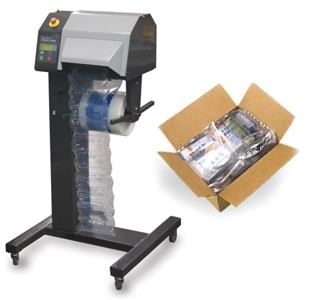
Sealed air transit packaging & inflating machine

Sealed air transit packaging & inflating machine

Transporting
From Harry’s online store, I should imagine that most of his transport needs are met by a courier such as DHL or other. I’m not sure what sort of stock-holding Heals will want to keep, but it’s certain that they will want to manage & move their stock in the most efficient way possible. To enable this, as well as relevant information, they will want frames boxed into suitable multiples (6, 10, 12 or whatever). The shipping boxes used will require their own ITF bar codes to enable ease of handling & storage.

Protecting
At least Phlib products are not frames that incorporate glass into their manufacture. This makes them lighter and less likely to get damaged in transit than the ‘glass variety’, although being thin metal, they are liable to get bent. Careful use of traditional ‘padding’ materials like corrugated board and bubble-wrap can provide a simple enough ‘filler’ to protect the product from crushing, but there are a number of alternative organic, compostable and ‘sealed air’ filler materials around
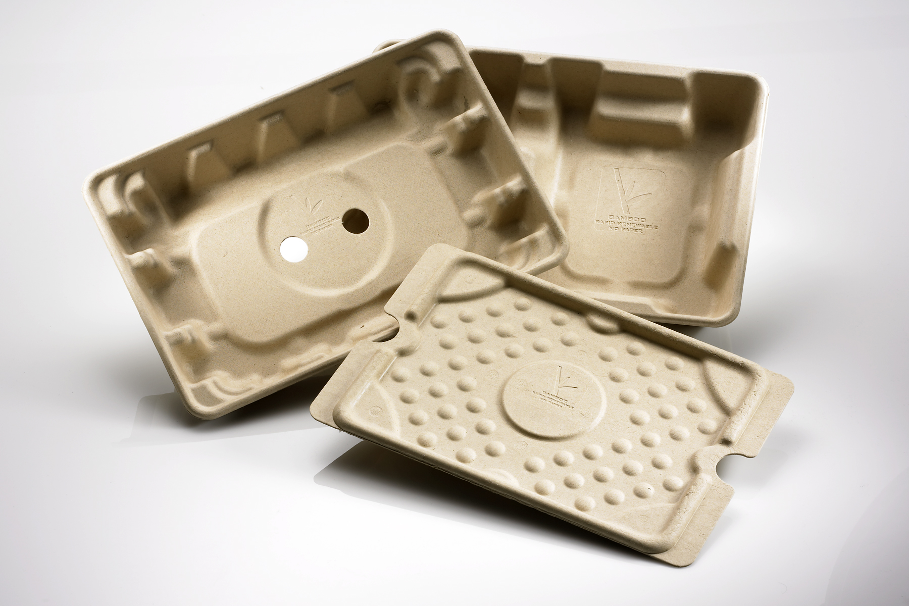
Bamboo transit packaging trays

Bamboo transit packaging trays

now that can also provide a more ‘environmentally friendly’ transit packaging solution. If you want an interesting insight into the perils of picture frame packaging issues and remedies, check out this interesting article on the topic on the Datalite website.

I hope that this has highlighted SOME of the packaging considerations that need to be taken into account when developing and selling a product like picture frames and supplying them to market. I’m not sure how many of these issues were discussed ‘off camera’ during the programme, but they all play their role in a successful launch, and ‘branding’ is only a part of the picture. So well done Harry, for getting this far, and we wish you every success in the future.

You can find out more about Harry’s products from his Phlib website.

Tomorrow is the last installment of our High Street Dreams reviews. I will take a look at the final product covered in the last TV programme and, as well a giving an overview of what happened in that show and how packaging and design aspects were tackled as above, I’ll also take a ‘step-back’ and provide my own thoughts on some of the other important issues that entrepreneur (Bex) needs to consider (or should have considered already) in the successful launch of her products to a mass market! So keep your eyes open for the following posting on this site:

Friday 23rd July: ‘Homeware’ – Bex Simon an artistic blacksmith who designs beautiful one-off metal-ware objects for the home.

Chris Penfold

Claire’s very English Jewellery packaging

Posted in Branding, Design, Events, Gift Packaging, Marketing, Opinion, Retailers, Uncategorized on July 21st, 2010 by Chris Penfold – 15 Comments
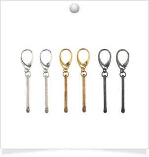
Claire's unique matchstick earrings

Claire's unique matchstick earrings

This article is a follow-on from the two that I wrote yesterday and Monday, which provided an overview on the packaging design aspects encountered in the recent mini series High Street Dreams on BBC1; The ‘reality TV show’ about product branding, packaging & design development. Over the series Jo Malone and Nick Leslau helped a number of individuals to launch new products.

Today we focus on Programme 3: ‘Fashion accessories’ striving to be the next fashion brand and in particular on Claire English, a contemporary jewellery designer from Lewes, East Sussex, making distinctive and eclectic homemade jewellery.

Help and advice was provided to Claire on the show in the form of Stephen Webster, a jeweller to ‘the Stars’, including Christine Aguellera, Kate moss and Cheryl Cole. He emphasised that, as a newcomer, Claire must “earn every inch”, “convey her story” and “focus” her collection. He thought that she needed a ‘hero’ (star) piece, to ‘draw the eye’ in the ‘polished’ environment of a designer shop to hold potential customer interest.

Claire did subsequently amend her product range and decided to be ‘the face & name’ of her own brand. During ‘market research pitches’ in a real retail environment, although her creative skills were without question, doubts about her commercial ability to run a business were raised. However, the team decided to let her pitch to Selfridges, the ‘flagship store’ in Oxford St, London, to Anne Pitcher the Buying and Merchandising Director. Claire’s packaging provided a “Beautiful presentation” with pretty bows and ribbons and cut with scissors – a nice touch! At £2 each, the boxes weren’t cheap (especially for a small business when the minimum order quantity is 1000), but they ‘did the trick’.

Some of Claire’s jewellery, made from unorthodox items such as ‘bubble blowers (see picture above) and matchsticks were seen as ‘very English’, with good ’stand-out’ in media such as magazines that would “give the ‘press’ something to talk about”. Indeed Claire was commended by Anne: “Congratulations – Quite extraordinary – You have thought about PR and POS material”. Although she was warned to “think about the competition”, which is something that is often a good starting point for us at Design Cognition when thinking about designing any new packaging. Not that we would necessarily follow the ‘norms’ of a particular sector, but at least it can provide a useful ‘benchmark’.

Ultimately although Selfridges liked Claire’s work very much, saying that it was” quite special”, they did not place an order on the day, because the jewellery was only at prototype stage. They wanted to wait until they had seen a ‘production sample’. Seeing as Claire’s work is now listed on her website as “available online from Selfridges”, we are assuming that she was finally successful, although there only appears to be one product on-show. A good starting point, but to develop a thriving business Claire will evidently need to ‘roll this out’ further at Selfridges and also through other channels. The on-line shop on Claire’s own website appears to be “coming soon”, which is a shame because she’s probably missing out on a lot of the good PR from the TV show, which could have given her a good kick start with her fledgling business.

Granted, that packaging is not the main selling point for a Claire’s jewellery – especially if it’s going to be sold on-line. However most of the items will be bought as gifts, and for a price of around £100 per item, customers will expect some nice packaging as part of the price.

As mentioned in my previous postings, when developing effective packaging, a unique set of circumstances needs to be considered, depending on the product itself, the route to market (whole supply chain) and consumer needs involved. Packaging performs a number of varied and important roles; containing, protecting. preserving, transporting, informing & selling and has to meet a number of important stakeholder needs at all stages of the supply chain, from manufacturing & filling, through warehousing & transportation, retail and consumer-use to final disposal or reuse.

Purchasing ‘fashion accessories’ like jewellery is a much more ‘tactile shopping experience’ than for other products like foods. As Claire seems to be concentrating sales presently through an on-line route, perhaps this is not so much of an issue, but as the brand and sales channels develop into more ‘customer facing’ ones, needs will evolve.
Claire showed on the programme that she has ‘an eye’ for some innovative gift packaging ideas with her bows & ribbons and this is a good start. This will enhance perceived ‘value’ and if developed to mirror her other branding will reinforce the brand credentials.

So what sort of things should Claire consider? Let’s have a look at them one at a time:

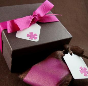
Daisy Chain jewellery packaging

Selling
On-line retail means the packaging does not really need to perform a selling role at Point of Sale (POS). However, the benefits of ‘added value’ gift packaging have already been mentioned and this can help promote referrals from clients, friends and relatives. If done properly and using stylish ‘must have’ packaging that could also act as a funky jewellery box, with subtle use of branding, the packaging will perform a permanent sales role on the dressing table. It may also help promote ‘up-selling’ to other pieces of Claire’s jewellery & trinkets. All merchandising; packaging, brochures, website design etc  – all need to work together to provide a consistent message and brand image. Take a look at the Daisy Chain packaging in the photo that is something that someone would want to keep and cherish.
Informing
If selling through retailers such as Selfridges, product and bar code information will be required. This may not necessarily be so for Claire’s own website initially, but as her business grows, this type of information will greatly aid her stock control. For consumers, useful information could include, at a basic level – jewellery name, collection name, materials, colour, price, contact details but at a more emotional and engaging level, provides an opportunity for Claire to ‘connect’ with her target market. She could’ like Beryl in yesterdays article, provide all sorts of information on the brand heritage, her vision for the business, brand values, the methods she uses to make the jewellery, the quality of materials & methods used and really build an emotional story on which to ‘pivot’ the brand.
Transporting
From Claire’s online store, I should imagine that most of her transport needs are met by DHL or some other courier. I’m not sure what sort of stock-holding Selfridges will want to keep (if any), but it’s certain that they will want to manage & move their stock in the most efficient way possible. To enable this, as well as relevant information, they will want jewellery boxed into suitable multiples (6, 10, 12 or whatever). The shipping boxes used will require their own ITF bar codes to enable ease of handling & storage.
Protecting
Jewellery manufactured from ‘hardy’ metallic materials but can be very delicate at the same time. Careful use of traditional ‘padding’ materials like coloured tissue paper can provide a simple enough ‘filler’ to protect the product from scratching and crushing, but at the same time can also provide a lovely ‘backdrop’ to accentuate and contrast the glistening colours of the metalwork. As well as product, any lovely gift boxes will need to be protected in some suitable transit packaging if being sent vie courier; it is not uncommon for packets to be used as ‘footballs by postal workers.

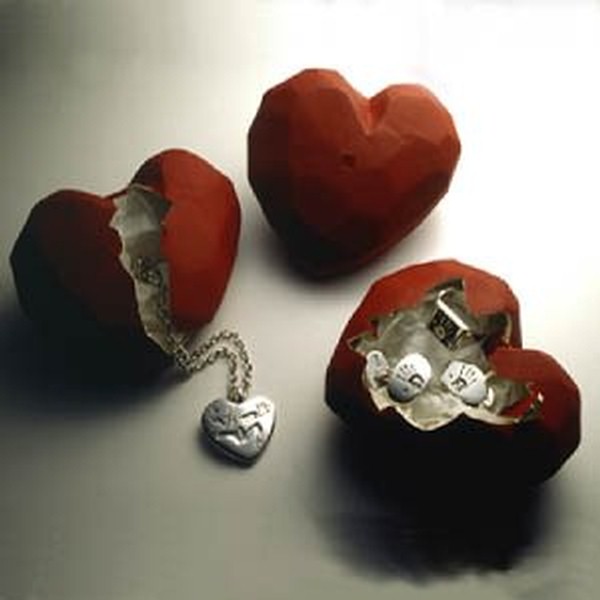
Heartbreak packaging - a novel approach to containment

Heartbreak packaging - a novel approach to containment

Containing
Containment is usually more of an issue for products like liquids and powders, which can spill or leak, rather than jewellery. Although Claire is presently selling on-line, as she builds a portfolio of products being sold in retail stores, she might want to consider how consumers will ‘contain’ their jewellery and gift boxes during the trip from shop to home. As with Beryl, this is another ideal opportunity for her to provide some ‘added value’ packaging, such as high quality branded shopping bags or boxes that will raise brand awareness and ‘perceived brand value’ with consumers and act as a ‘walking’ advert through the shopping streets of our towns & cities. Take a look at the novel Stephen Einhorn ‘Heartbreak’ packaging, which provides a great ‘twist’ on containment, with all sorts of subliminal messaging that will help engage potential customers.

I hope that this has highlighted SOME of the packaging considerations that need to be taken into account when developing a product like jewellery and supplying it to market. I’m not sure how many of these issues were discussed ‘off camera’ during the programme, but they all play their role in a successful launch, and ‘branding’ is only part of the picture. So well done Claire and we wish you every success in the future.

You can find out more about Claire’s products from her Claire English Special Jewellery website.

Over the next 2 days, I’ll take a look at the other 2 products covered in the last TV programme and, as well a giving an overview of what happened in those shows and how packaging and design aspects were tackled as above, I’ll also take a ‘step-back’ and provide my own thoughts on some of the other important issues that those entrepreneurs need to consider (or should have considered already) in the successful launch of their products to a mass market! So keep your eyes open for the following postings on this site:

Thursday 22nd July: ‘Homeware’ – Harry Singer from Somerset with his innovative wall hanging picture ‘Monkey frames’ ( Phlib) product.

Friday 23rd July: ‘Homeware’ – Bex Simon an artistic blacksmith who designs beautiful one-off metal-ware objects for the home.
Chris Penfold
‘Necking it’ – Woolly packaging for ‘Queen Beryl’?

Posted in Branding, Design, Events, Gift Packaging, Marketing, Opinion, Retailers on July 20th, 2010 by Chris Penfold – 10 Comments
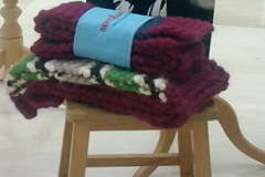
Beryl's scarves with proposed packaging

Beryl's scarves with High Street Dreams packaging

This article is a follow-on from the one I wrote yesterday, which provided an overview on the packaging design aspects encountered in the recent mini series High Street Dreams on BBC1; The ‘reality TV show’ about product branding, packaging & design development. Over the series Jo Malone and Nick Leslau helped a number of individuals to launch new products.

Today we focus on Programme 3: ‘Fashion accessories’ striving to be the next fashion brand and in particular on Beryl Brewis, a single mum with 2 teenagers from Buckinghamshire, producing high quality chunky hand-knitted scarves.

Help and advice was provided to Beryl on the show in the form of fashion’s most vocal critics to give their verdicts: Nicole Smallwood from Marie Claire, Angela Bottolph online editor from Gratzia magazine, Mario Latandie from Tatler, Dolly Jones from Vogue.com and Kate Creasy from Cosmopolitan.

The general feeling was that they liked Beryl’s ‘rich & earthy’ colours, but didn’t like her chunky buttons. However, they did think that the scarves were well overpriced, considering comparable competition.
So what was the remedy? Creative Director of Pringle, Claire Waight Keller (ex-Gucci and Ralf Lauren) was brought in to give the benefit of her experience. She thought that the texture & colours were “great” but had to be ‘brutal’ to get Beryl to see ‘the bigger picture’ – not to be “too precious”. So it was ‘off with the buttons’ to give a “richer more playful scarf” and a small patch of stripes to provide a much more exciting product range.

But, as with many small businesses, a major problem for Beryl is how to upscale from a 1 person operation to a larger corporation, increasing output but still maintaining Quality Control, which Beryl has tackled by using her ‘granny army’ of local OAPs.

Branding guru Perry Haydn Taylor was brought in; a top branding consultant who has branded many top products such as Boden clothing & Gu desserts. His team undertook some promotional filming which was executed well and “really brought it to life” for Beryl. Perry’s team also designed some prototype packaging, which consisted of a paper wrap-around label (see photo above). Granted, that packaging is not the main selling point for a handmade high-quality scarf, but I felt that it was pretty basic and a bit ‘lacking’, for the following reasons….

For each of the product areas covered in the TV programmes, a unique set of circumstances needs to be considered, depending on the product itself, the route to market (whole supply chain) and consumer needs involved.

Packaging performs a number of varied and important roles; containing, protecting. preserving, transporting, informing & selling and has to meet a number of important stakeholder needs at all stages of the supply chain, from manufacturing & filling, through warehousing & transportation, retail and consumer-use to final disposal or reuse.

Purchasing ‘fashion accessories’ like clothes & scarves is a much more ‘tactile shopping experience’ than for other products like foods. Whilst some up-market strategically placed packaging can enhance perceived ‘value’, the printed text is mainly aimed at reinforcing the brand credentials and providing product and bar code information for identification and tracking logistics movements and sales.

So what sort of things should Beryl consider? Let’s have a look at them one at a time:

saskia rose packaging

Saskia Rose packaging

Selling
The selling role involved for the scarf packaging will depend to a certain extent on whether Beryl takes the retailer route to market or an on-line one. If both routes are being used, the selling role is obviously more important in a store and will need to work in tandem with any merchandising at Point of Sale (POS), brochures, website design etc  – it all needs to work together to provide a consistent message and brand image.
Informing
As well as the product and bar code information mentioned above, useful consumer information could include, at a basic level – scarf colour shade, scarf length, price, contact details but at a more emotional level, provides an opportunity for Beryl to ‘connect’ with her target market. She could provide all sorts of information on the brand heritage, her vision for the business, brand values, the people that knit the scarves, the quality of wools and yarns used and really build an emotional story on which to ‘pivot’ the brand.
Transporting
Retailers will want to manage & move their stock in the most efficient way possible. To enable this, as well as relevant information, they will also want scarves boxed into suitable multiples (6, 10, 12 or whatever). The shipping boxes used will have their own ITF bar code requirements to enable ease of handling & storage. Beryl might not be shipping lorry loads (yet), but boxes should certainly be designed for optimum pallet fit.

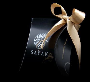
Sayak Silver Jewellery Gift Box

Containing
Containment is usually more of an issue for products like liquids and powders, which can spill or leak. However, Beryl might want to consider how consumers will ‘contain’ their scarves during the trip from shop to home. This is another ideal opportunity for her to provide some ‘added value’ packaging, such as high quality branded shopping bags or boxes that will raise brand awareness and ‘perceived brand value’ with consumers and act as a ‘walking’ advert through the shopping streets of our towns & cities. Take a look at the pictures here of the Saskia Rose bag and box packaging range and the Sayak jewellery packaging as stylish examples.
Protecting
One could argue that scarves, being woolen, are in little need of protection and to a certain extent that is true – certainly compared to many other products. However although fairly ‘flexible’ and ‘forgiving’, there is certainly a need to consider protection from the elements such as direct sunlight (which might cause fading), moisture (which might cause mildew), vermin attack (in dark/damp warehouses) and taint or damage from other products (such as chemicals) stored in the near vicinity during transport or warehousing. As Beryl considers export markets, these issues will become greater and more complex.
Preserving
A scarf will not have a limited shelf life like a food product, although it might well go ‘out of season’ or ‘out of fashion’. So preservation is not so much of an issue here, although optimum packaging, to protect from the dangers raised in ‘Protection’ above, will ensure that the scarves reach their destination in perfect ‘tip-top’ condition and in exactly the same state as when they left the knitting needles!

I hope that this has highlighted SOME of the packaging considerations that need to be taken into account when developing a product like a scarf and supplying it to market. Developing packaging with sustainability and the environment in mind is another area that I have not discussed and goes ‘without saying’ these days. I’m not sure how many of these were discussed ‘off camera’ during development, but they all play their role in a successful launch, and ‘branding’ is only part of the picture.

Anyhow, despite the issues that I have raised, Beryl’s products were well-liked when she ‘pitched’ to a team of buyers headed by Belle Robinson who co owns Jigsaw (she has a husband who started the brand originally) and Beryl secured an order worth £25K. So well done Beryl and we wish you every success in the future.

You can find out more about Beryl’s products from her Berylware website.

Over the next 3 days, I’ll take a look at the other 3 products covered in last two shows and as well a giving an overview of what happened in those shows and how packaging and design aspects were tackled, as above, I’ll also take a ‘step-back’ and provide my own thoughts on some of the other important issues that those entrepreneurs need to consider (or should have considered already) in the successful launch of their products to a mass market!

So keep your eyes open for the following postings on this site:
Wednesday 21st July: ‘Fashion accessories’ striving to be the next fashion brand. Claire English from Lewes, East Sussex making distinctive and eclectic homemade jewellery.

Thursday 22nd July: ‘Homeware’ – Harry Singer fro Somerset with his innovative wall hanging picture ‘Monkey frames’ ( Phlib) product.

Friday 23rd July: ‘Homeware’ – Becks (Bex) Simon an artistic blacksmith who designs beautiful one-off metal-ware objects for the home.
Chris Penfold