Posts Tagged ‘food’

Bisphenol A (BPA) Confusion – watch this space!

Posted in Drinks Packaging, Food Packaging, Legal, Materials on January 18th, 2010 by Jane Bear – 7 Comments

Confusion still reigns over the use of food packaging containing Bisphenol A.

The food standards agency in Australia and New Zealand seem to think that the risk is ‘very low and does not pose a significant health risk’

The Food and Drug Administration in America announced on Friday last week that they feel it’s use is ‘now of some concern’ – they would like to see it’s used phased out in the food and drink area.

The European Food Safety Authority has said that it wants to discuss the FDA’s announcement and the UK Food Standard Agency says that it’s position remains unchanged and feels that the amount of BPA in food packaging “is well below levels considered harmful.”

Looks like this subject could carry on rumbling for quite a while before a consensus is reached – in the meantime, it might be best to ensure any new food and drink products you develop/launch have packaging that doesn’t contain BPA (Jane)

via EFSA to evaluate FDA decision on bisphenol A.

via Bisphenol A (BPA) and food packaging (January 2010) – Food Standards Australia New Zealand.

India could be your next big market

Posted in Drinks Packaging, Food Packaging, Machinery on January 12th, 2010 by Jane Bear – 11 Comments

Interesting article.  I believe the biggest majority of the packaging will be manufactured in the country, but if you have the technology/machinery for sale it might be worth you considering India as your next target market.  Their upgrades and increased sophistication will have to come from somewhere.  (Jane)

Food packaging in India will undergo huge changes in the next five years as companies increasingly use it as an important vehicle for product differentiation, said a report from Datamonitor.

via India set for food packaging revolution.

Labelling Standards Proposed for Caffeine

Posted in Drinks Packaging, Food Packaging, Government, Healthcare & Pharma, Legal, Opinion, Safety on January 5th, 2010 by Chris Penfold – 6 Comments

States News Service, 29th December 2009 via www.packagingdigest.com

(Relating to information released by the National Association of Convenience Stores in the US)

With the growing popularity of caffeinated foods and beverages – recent years have seen the introduction of caffeine-infused chewing gum, drinks and potato chips. The Los Angeles Times has reported that, due to health concerns, some health experts have proposed introducing labelling standards for caffeine.

It is believed that there is a need to educate consumers about caffeine’s effects on the body, which according to  James Lane, a professor of medical psychiatry at Duke University Medical Center, can lead to problems such as attention deficit disorder, hyperactivity, high blood pressure, and insomnia.

Personally I think that this is a sound initiative, being proposed for the right reasons, although it will inevitably lead to further problems of text fit onto already cramped packs. What do you think? Chris Penfold

You can read the full article at: The Packaging Digest

Increasing legislation v reducing pack sizes – the labelling dilemma!

Posted in Branding, Cosmetics & Toiletries, Design, Drinks Packaging, Environmental Issues, Food Packaging, Gift Packaging, Healthcare & Pharma, Innovation, Legal, Marketing, Opinion, Technology, Uncategorized, cost-optimisation on January 4th, 2010 by Chris Penfold – 5 Comments

The normal packaging development  process would involve firstly developing a pack to fit the product in an optimum manner. Then any legally required text would be positioned (including any required symbols, such as recycling logos). Finally the marketing requirements would be implemented, in terms of claims, branding etc. More often than not, there is then a need to go back to product marketers to get them to reduce their marketing copy on the packs, because it simply won’t fit……..and the situation is getting worse!

Other options that can help tackle this problem are:

A, reducing the font size – but this can have implications on readability, print process constraints and there is often a legal minimum size which needs to be adhered to.

B, Using paginated label leaflet formats – where, on occasions, we have developed up to a 10-page concertina style leaflets. However, these multi-layered add-ons can add a huge on-cost onto the price of a pack – for which marketers don’t always want to pay.

C, Printing on the inside of pack (e.g. cartons) – but not visible until a pack is opened. So one can’t do this with certain text which needs to be visible at time of purchase

D, Finally, if all else fails, considering increasing the overall size of the packaging.

An example of a multi-page label solution

An example of a multi-page label solution

This latter route is sometimes unavoidable, especially with pharmaceutical packs, where the packs are very small, and even after taking measures such as reducing the bar codes from 13 digit to 8 digit, there is simply not enough room to display the mandatory legal minimum required text (let alone any marketing text).

Furthermore, it is now the law for any new medicines to incorporate Braille on the packaging (it will be a requirement for all existing medicines by October 2010). This will have to detail the product name, the strength [of the medication] and the dose form – yet another constraint to bear in mind. New products also have to conform with the readability guidelines which are in place to ensure that the packs can be read clearly and understood by the patient/consumer).

It’s worth remembering that it’s not just the basic information that one has to put on the pack. Very this has to be repeated it in a number of  different languages. It’s not unusual for a European product to have a need for 12 languages. And then there might be a need to repeat ‘country of origin’ for every language, and could require five countries needing to be listed (for a range of ingredients). The result could be a situation where  all one has room to display is a list of ingredients  & addresses, and any wish for aesthetic beauty just ‘goes out of the window’.

At Design Cognition, we review the whole space to find an ideal design that looks most aesthetically appealing and hopefully doesn’t look too cluttered – but it’s not always easy!

Incorporating logos of different colours, or trying to mix varying colours of text with backgrounds, can add its own issues and problems. Sometimes ‘house colours’ do not lend themselves to readability, White text on a pastel or black background for instance, can be even harder to read, so we may need to redesign [the pack graphics], using the principles and processes detailed above.

Overall our job is to develop a pack that is fit for purpose and not over-packaged. Things are becoming increasingly challenging but, so far our use of creativity and lateral thinking has provided a suitable solution.

Moving forwards technology could aid some of the issues raised above. Nowadays, certain consumer/marketing information can be shown ‘on-line’, cutting down the need to put it all on-pack – maybe just a web address for further information. There have also been great leaps forward in microchip technology which will enable ‘talking packs’, ‘moving pictures’ and a whole new interactive consumer experience – taking packaging to a new level. These are all areas in which Design Cognition has a strong interest and is working with a number of suppliers to develop cost-effective solutions.

If you’d like more information on these areas, sign up for further information HERE

Chris Penfold

Multisensoric trend key to confectionery packaging, claims German group

Posted in Design, Food Packaging, Gift Packaging, Innovation, Marketing, Materials, Product News, Retailers, Technology on December 17th, 2009 by Anne Dallison – 6 Comments

The use of Multisensoric for confectionery packaging on the increase

By Jane Byrne , 15-Dec-2009

Appealing to consumers’ five senses through innovative packaging techniques can result in increased brand loyalty and greater impact at point of sale, and it is a key driver in confectionery packaging, according to the organisers of the 2010 Pro Sweets trade show.

Multisensoric is an approach to packaging design that allows packaging to stimulate and arouse emotions in consumers to encourage purchase and examples include such elements as striking colour schemes, windows to view the product, exciting rustling sounds and foldout trays.

The Pro Sweets team said that, as a result, the confectionery industry is increasingly focused on touch, sight and sound finished packaging elements such as foil lamination, textured embossing, and varnishes.

via Multisensoric trend key to confectionery packaging, claims German group.

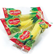
How to prolong the shelf life of a banana

Posted in Design, Environmental Issues, Food Packaging, Innovation, Materials, Retailers, Uncategorized on December 9th, 2009 by Jane Bear – 4 Comments

I suppose there are pros and cons – is it better to protect the food with more packaging so that it can be stored for longer and there is less food waste – or better to scrap the food and save on the packaging?  I think if they can find a way of making the film from a biodegradable material then this has the potential to be a real step forward.  It would take some selling to the general public though, there appears to be a large number who believe that all packaging is evil, regardless of it’s use or benifit. (Jane)

 packaging single banana

Health-conscious consumers bananas are a welcome part of a convenience store’s offering. That is, until they turn brown. Which is why Del Monte developed a new plastic wrap for bananas that promises to more than double their shelf life by keeping out air and moisture. 7-Eleven has been trialling the second skin in 27 of its Dallas-area stores. If the trial is successful, the bananas-in-bags could be stocked in the majority of the chain’s 5,787 shops by early 2010.

From the perspective of consumer health that’s a thumbs up, but some have criticized the extra packaging as environmentally unsound. After all, bananas come wrapped in their own protective layer. Del Monte is looking to develop biodegradable packaging, but also stresses that the new plastic wrapper reduces the overall carbon footprint by enabling a reduction in deliveries. The company is also introducing specially packaged bananas in vending machines, underlining the wider context of increased consumer demand for food that’s both healthy and convenient. (Related: Vending machines for healthy food — Vending machines for farm produce.)

via New packaging prolongs shelf life of bananas – Springwise.

“Achieving attention- – by structural innovation”

Posted in Branding, Cosmetics & Toiletries, Design, Drinks Packaging, Food Packaging, Healthcare & Pharma, Innovation, Marketing, Materials, Product News, Retailers, Technology on December 4th, 2009 by Anne Dallison – 15 Comments

Interesting article and data  on the importance of continued investment into innovative packaging and graphics (Annie)

Year long survey consistently finds that structure might best communicate innovation, especially with supportive graphics. Materials and production also are good barometers. In any economic environment, innovation is key to growth. But, during a recession, many companies are tempted to reduce spending on innovation to save money. Luckily, this is not an absolute rule. Daring brands still pushed the boundaries of packaging innovation in 2009.Earlier this year, Shelf Impact! and international brand consultancy Dragon Rouge formed a partnership to ask branding and packaging professionals to evaluate recent product and packaging innovations. Each quarter, we asked a sample of hundreds of Shelf Impact! readers, from brand managers to designers to materials suppliers, to rate a selection of packages on matters of innovation. View an image and brief description of each of the 10 packages reviewed this quarter.

via Shelf Impact: “Achieving attention-getting innovation” Filed In:.

Branded barcodes cheer Japanese shoppers

Posted in Branding, Cosmetics & Toiletries, Design, Drinks Packaging, Food Packaging, Gift Packaging, Innovation, Marketing on November 12th, 2009 by Jane Bear – 20 Comments

I think this is a fantastic idea – the barcode needs to be there anyway, so why not make a feature of it.  Obviously it’s more suited to certain areas of the market than others – I’m not sure a patient would appreciate finding one of these on a medicine, but then again on a more everyday or fun item I think it could be a great area to add some individuality and extra branding. (Jane)

While most Western manufacturers focus their marketing on the front of a product, a growing number of Japanese firms are branding the barcodes on the reverse as well. The black and white etchings contain sufficient detail to be recognised by scanners, while also incorporating the firms logo or an image associated with the product.

via Branded barcodes cheer Japanese shoppers – Telegraph.

Nestle may move Fairtrade with Kit Kat

Posted in Branding, Food Packaging, Marketing on November 10th, 2009 by Jane Bear – 5 Comments

So is this going to be the next must have claim for chocolate? (Jane)

Media reports have suggested that Nestlés leading chocolate brand Kit Kat is set to become Fairtrade certified, in a move that would mirror Cadbury’s recent move to Fairtrade for its Dairy Milk chocolate. KitKat is the biggest selling chocolate bar in the UK and it sales in that country have risen 8.6 per cent since the start of the year. Certification of the brand would certainly catapult the notion of Fairtrade into the minds of chocolate consumers.

via Nestle may move Fairtrade with Kit Kat.

Cadbury replaces Roses tin with cardboard box

Posted in Design, Environmental Issues, Food Packaging, Recycling on November 5th, 2009 by Jane Bear – 2 Comments

Looks a lovely pack and will be much easier to wrap at Christmas -  just goes to show that becoming more environmently friendly doesn’t have to mean loss of style or shelf presence.  It will be interesting to see how the packs withstand possible transit damage.  The tins always seemed very prone to picking up ‘dints’ on shelf.  I hope the pack does really well and look forward to seeing more of the ‘bought to share’ chocolate brands move this way.  (Jane)

Cadbury is trialling a cardboard replacement for its traditional Roses chocolates tin in a bid to reach its packaging weight reduction targets for seasonal and gift packaging.

via Cadbury replaces Roses tin with cardboard box | packagingnews.co.uk.